Projects

Case study · 01/02

iFood UX Case

Desk research and a usability test on how easily users find help in the app when something goes wrong with an order.

Type
Hands-on project — UX Design course, EBAC
Year
2026
Methods
Desk research · Review analysis · Usability testing

Academic project, not affiliated with iFood.

Context

iFood is a Brazilian technology company founded in 2011 that operates as a marketplace. Instead of producing or selling food directly, it connects four groups: consumers, restaurants and other businesses, couriers and the platform itself.

Initially focused on restaurant delivery, the service expanded to supermarkets, pharmacies, pet shops, convenience stores and other retailers, becoming an ecosystem for local commerce and fast delivery.

Target audience

ConsumersRestaurantsCouriersCompanies (iFood Benefícios)
Downloads
100M+
Average rating
4.7
Reviews
13.5M

Source: Google Play

Competitors

Competitors vary by segment: food delivery, groceries and fast delivery.

CompanyDifferentiator
iFoodMarket leader
RappiSuper app
AiqfomeInland Brazil
Delivery MuchSmaller cities
Own appsDirect sales

Problem

A manual analysis of 20 app reviews showed that 35% reported problems related to delays, cancellations, payment and support.

Reviews analyzed
20
With problems
35%
Without this problem
65%

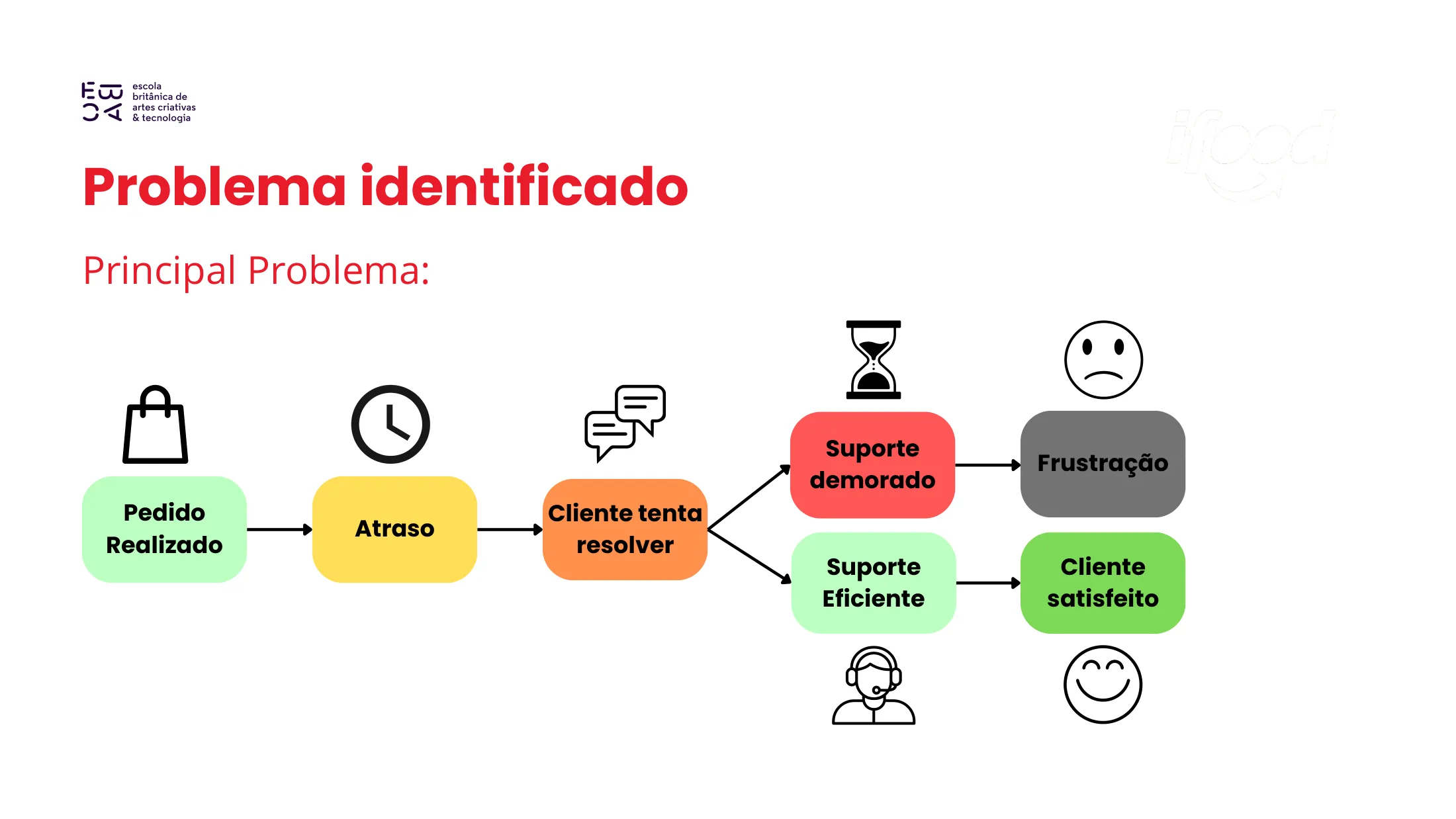
The main problem is what happens after a delay: the customer tries to solve it and, if support is slow, the journey ends in frustration. With efficient support, it ends with a satisfied customer.

Journey diagram: order placed, delay, customer tries to solve it; slow support leads to frustration, efficient support leads to a satisfied customer.
Fig. 01 — Problem journey (in Portuguese)

Process

Usability test

Goal
Observe how easily users find help or support in the app when something goes wrong with an order.
Participants
4 frequent users of delivery apps, aged 22 to 35.
Task
“Imagine your order is more than 20 minutes late. Find where in the app you can talk to support or request a cancellation/refund.”
Method
Moderated test using the Think Aloud technique (thinking out loud while navigating).

Main problems found

  1. 01

    Hard to find the help option

    3 of the 4 users hesitated when looking for the direct support channel on the order status screen, clicking secondary menus before finding it.

  2. 02

    Ineffective automated replies

    Participants felt the support bot did not understand specific problems, creating a “loop” of questions that delayed human contact.

  3. 03

    No visibility on response times

    None of the participants clearly found how long support would take to reply after opening a ticket.

Solution

Insights

  1. 01

    Friction in a crisis journey

    Hungry and with a late order, users are highly anxious. Navigating hidden menus increases frustration.

  2. 02

    Transparency builds trust

    Users were calmer when support made their place in the queue or the estimated response time clear.

  3. 03

    Direct access

    Users expect a visible “I need urgent help” button on the order tracking screen itself.

Improvement proposal

  • A fixed “I need help” button on the order tracking screen, visible without scrolling.
  • An estimated support response time indicator.
  • An automated cancellation button with an immediate refund when the delay goes past a tolerable limit (e.g. 30+ min beyond the original estimate), reducing the load on human support.

Learnings

iFood’s problem lies in the crisis journey: when an order is late, support is hard to find, the bot does not solve the issue and the user is left without information about response times.